Packages
pacman::p_load(sf, tidyverse, tmap, spdep, patchwork, ggthemes)Developing countries are most affected by water shortages and poor water quality. Up to 80% of illnesses in the developing world are linked to inadequate water and sanitation. Despite technological advancement, providing clean water to the rural community is still a major development issues in many countries globally, especially countries in the Africa continent.
To address the issue of providing clean and sustainable water supply to the rural community, a global Water Point Data Exchange (WPdx) project has been initiated. The main aim of this initiative is to collect water point related data from rural areas at the water point or small water scheme level and share the data via WPdx Data Repository, a cloud-based data library.

The main aim of the study is to understand the dynamics of spatial patterns of non-functional water points in Nigeria and its diffusion over spatial boundaries by applying appropriate global and local measures of spatial association techniques.

Some of the important steps performed in this study are as follows
Importing shapefile into R using sf package.
Deriving the proportion of functional and non-functional water point at LGA level using appropriate tidyr and dplyr methods.
Combining the geospatial and aspatial data frame into simple feature data frame.
Performing outliers/clusters analysis by using appropriate local measures of spatial association methods.
Performing hotspot areas analysis by using appropriate local measures of spatial association methods.
Thematic Mapping - Plotting maps to show the spatial distribution of functional and non-functional water point rate at LGA level by using appropriate thematic mapping technique provided by tmap package
Analytical Mapping - Plotting hotspot areas and outliers/clusters maps of functional and non-functional water point rate at LGA level by using appropriate thematic mapping technique provided by tmap package
For this study, data from WPdx Global Data Repositories and geoBoundaries are used. Both are in geospatial format. These dataset provide information about waterpoints and Nigeria’s Administrative boundary shape file.
| Data Type | Description | Source |
|---|---|---|
| Geospatial | Nigeria Level-2 Administrative Boundary | Geoboundaries |
| Geospatial | Water point related data on WPdx standard | Waterpoint access data |
Let us try to understand the dynamics of spatial patterns of non-functional water points in Nigeria and its diffusion over spatial boundaries using appropriate global and local measures of spatial association techniques.
Let us first load required packages into R environment. p_load function pf pacman package is used to install and load sf and tidyverse pacagkes into R environment.
Now let us import both the geospatial data. The code chunk below uses st_read() function of sf package to import geoBoundaries-NGA-ADM2_simplified shapefile and geo_export into R environment.
Two arguments are used :
dsn - destination : to define the data path
layer - to provide the shapefile name
st_read() of sf package is used to import geo_export and geoBoundaries-NGA-ADM2_simplified shapefile into R environment and save the imported geospatial data into simple feature data table.
filter() of dplyr package is used to extract water point records of Nigeria.
In order to reduce the file size let us save the data in .rds format.
write_rds() of readr package is used to save the extracted sf data table into an output file in rds data format.
Let us now preprocess the data before performing any analysis
Here, we are recoding the NA values into Unknown. In the code chunk below, replace_na() is used to recode all the NA values in status_cle field into Unknown.
As our objective is to focus on waterpoints, let us extract the three types and save it as a dataframe for further analysis
wpt_functional <- wp_nga %>%
filter(status_cle %in%
c("Functional",
"Functional but not in use",
"Functional but needs repair"))
wpt_nonfunctional <- wp_nga %>%
filter(status_cle %in%
c("Abandoned/Decommissioned",
"Abandoned",
"Non-Functional",
"Non functional due to dry season",
"Non-Functional due to dry season"))
wpt_unknown <- wp_nga %>%
filter(status_cle == "Unknown")In the code chunk above, filter() of dplyr is used to select the specific water points.
We have to perform 2 steps to calculate the total number of functional, non-functional and Unknown waterpoints in each division.
Let us identify no. of waterpoints located inside each division by using st_intersects().
Next, let us calculate number of waterpoints that fall inside each division by using length() function.
nga_wp <- nigeria %>%
mutate(`total wpt` = lengths(
st_intersects(nigeria, wp_nga))) %>%
mutate(`wpt functional` = lengths(
st_intersects(nigeria, wpt_functional))) %>%
mutate(`wpt non-functional` = lengths(
st_intersects(nigeria, wpt_nonfunctional))) %>%
mutate(`wpt unknown` = lengths(
st_intersects(nigeria, wpt_unknown)))Now, let us calculate what is the overall proportion of functional and non-functional waterpoints by dividing the no. of functional waterpoints by the total no. of waterpoints. Similarly, for non-functional waterpoint proportion, numerator is replaced by non-functional waterpoint.
In order to manage the storage data efficiently, we are saving the final data frame in rds format.
Before performing spatial analysis, let us first do some preliminary data analysis to understand the data better in terms of water points.
Before visualising, its important for us to prepare the data. Based on WPDx Data Standard, the variable ‘#status_id’ refers to Presence of Water when Assessed. Binary response, i.e. Yes/No are recoded into Functional / Not-Functional.
ggplot(data= ngawater_sf,
aes(x= `#status_id`)) +
geom_bar(fill= '#CD5C5C') +
#ylim(0, 150) +
geom_text(stat = 'count',
aes(label= paste0(stat(count), ', ',
round(stat(count)/sum(stat(count))*100,
1), '%')), vjust= -0.5, size= 2.5) +
labs(y= 'No. of \nwater points',
x= 'Water Points',
title = "Distribution of water points") +
theme(axis.title.y= element_text(angle=0),
axis.ticks.x= element_blank(),
panel.background= element_blank(),
axis.line= element_line(color= 'grey'),
axis.title.y.left = element_text(vjust = 0.5),
plot.title = element_text(hjust=0.5))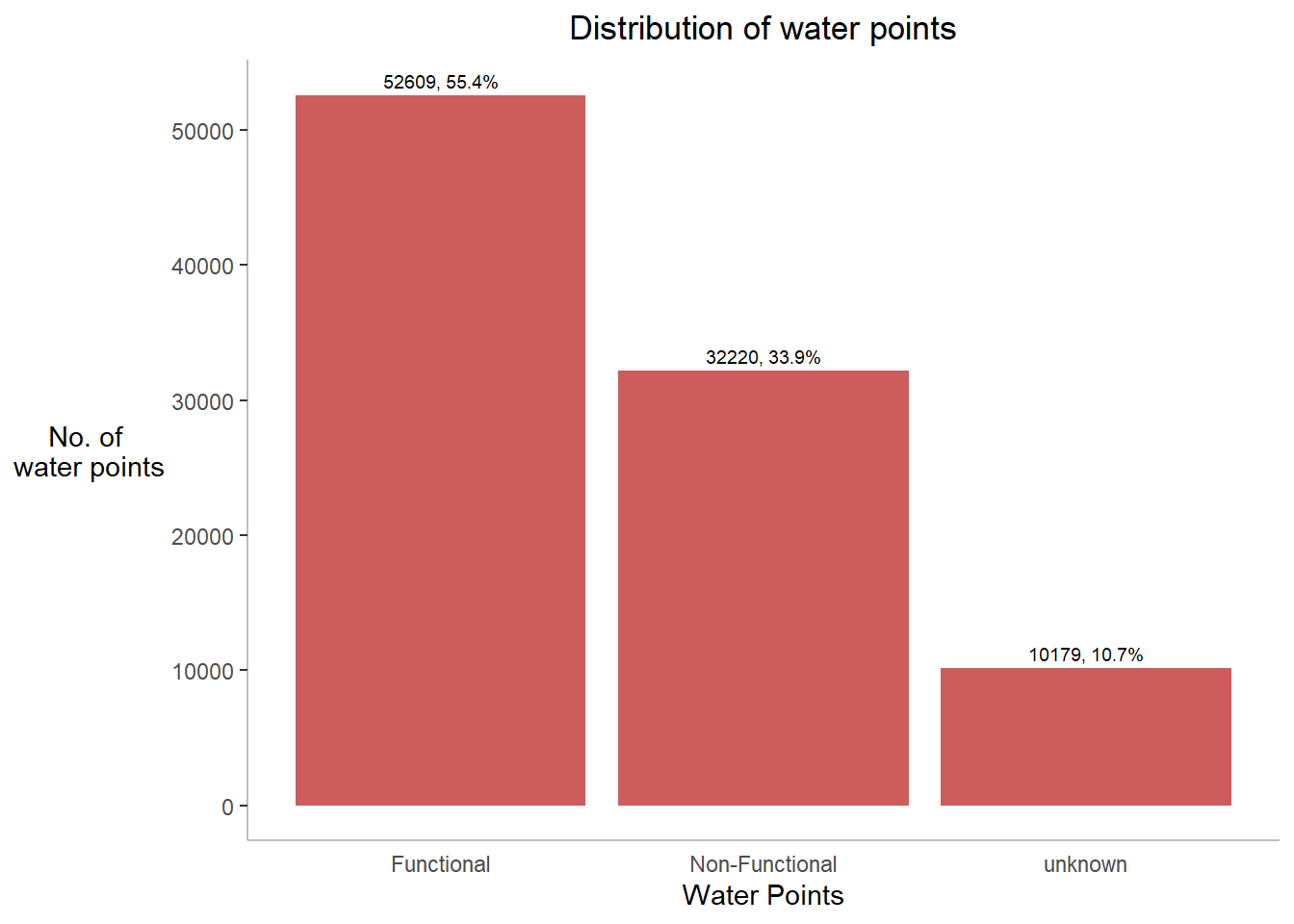
Insights:
Nigeria consists of almost 55% of functional, 34% of non-functional and 11% of unknown waterpoints.
First let us prepare the data
p3 <- ggplot(data=top_10,
aes(x=shapeName,
y=prop,
fill=waterpoint_status))+
geom_col()+
geom_text(aes(label=paste0(prop,"%")),
position = position_stack(vjust=0.5),size=3)+
theme(axis.text.x=element_text(angle=0))+
xlab("Division")+
ylab("% of \n Waterpoints")+
ggtitle("Proportion of waterpoints by District")+
theme_bw()+
guides(fill=guide_legend(title="Waterpoint"),
shape=guide_legend(override.aes = list(size=0.5)))+
theme(plot.title = element_text(hjust=0.5, size=13),
legend.title = element_text(size=9),
legend.text = element_text(size=7),
axis.text = element_text(face="bold"),
axis.ticks.x=element_blank(),
axis.title.y=element_text(angle=0),
axis.title.y.left = element_text(vjust = 0.5))
p3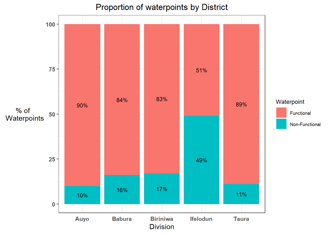
Insights:
Among the divisions which have most no. of waterpoints, in Ifelodun division, almost 50% of waterpoints are non-functional. It is a matter of concern.
To find out the solution for this question, first let’s prepare the data accordingly:
ggplot(data = nonfunc_top10,
aes(y = reorder(shapeName, n),
x=n)) +
geom_bar(stat = "identity",
fill = "coral")+
labs(y= 'Division',
x='No. of Non-Functional water points',
title="Top 10 divisions by Non-Functional waterpoints",) +
geom_text(stat='identity', aes(label=paste0(n)),hjust=-0.5)+
theme(axis.title.y=element_text(angle=0),
axis.ticks.x=element_blank(),
panel.background = element_blank(),
axis.line = element_line(color='grey'),
plot.title = element_text(hjust = 0.5),
axis.title.y.left = element_text(vjust = 0.5),
axis.text = element_text(face="bold") )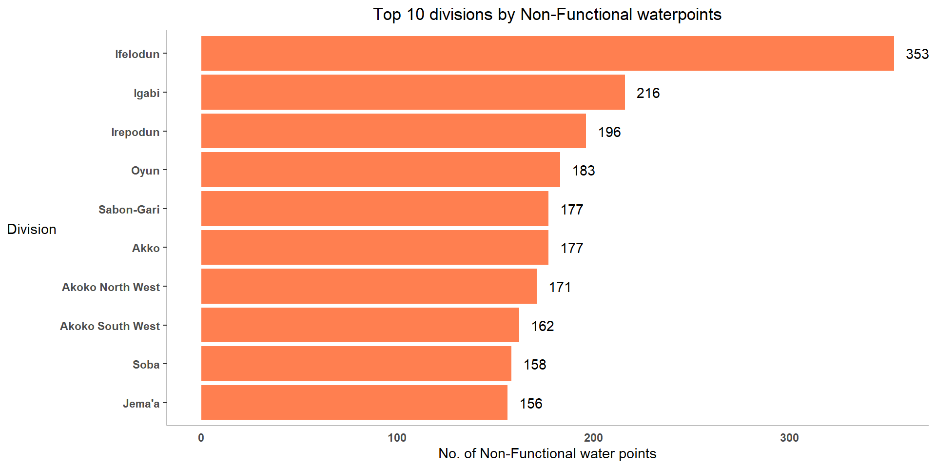
Insights:
Among all 774 administrative level 2 divisions, Ifelodun has most no. of non-functional water points followed by Igabi, Irepodun, Oyun and Sabon-Gari.
As our objective is to focus more on non-functional waterpoints, let us try to understand what are the major causes for a water point to become non-functional and which contributes the most?
To find out the solution for this question, first let’s prepare the data accordingly:
wpt_nonfunctional <- read_rds("data/wpt_nonfunctional.rds")
wpt_nonfunctional <- wpt_nonfunctional %>%
mutate(status_cle=recode(status_cle,
'Non-Functional due to dry season'='Dry Season',
'Non functional due to dry season'='Dry Season',
'Abandoned/Decommissioned' = 'Abandoned / Decommissioned',
'Abandoned' = 'Abandoned / Decommissioned'))
nonfun_order <- factor(wpt_nonfunctional$status_cle, level = c('Non-Functional', 'Dry Season','Abandoned / Decommissioned'))ggplot(data= wpt_nonfunctional,
aes(x= nonfun_order)) +
geom_bar(fill= 'plum') +
#ylim(0, 150) +
geom_text(stat = 'count',
aes(label= paste0(stat(count), ', ',
round(stat(count)/sum(stat(count))*100,
1), '%')), vjust= -0.5, size= 2.5) +
labs(x= 'Reasons',
y= 'No. of \nwater points',
title = "What are the causes of non-functional water points?") +
theme(axis.title.y= element_text(angle=0),
axis.ticks.x= element_blank(),
panel.background= element_blank(),
axis.line= element_line(color= 'grey'),
axis.title.y.left = element_text(vjust = 0.5),
plot.title = element_text(hjust=0.5))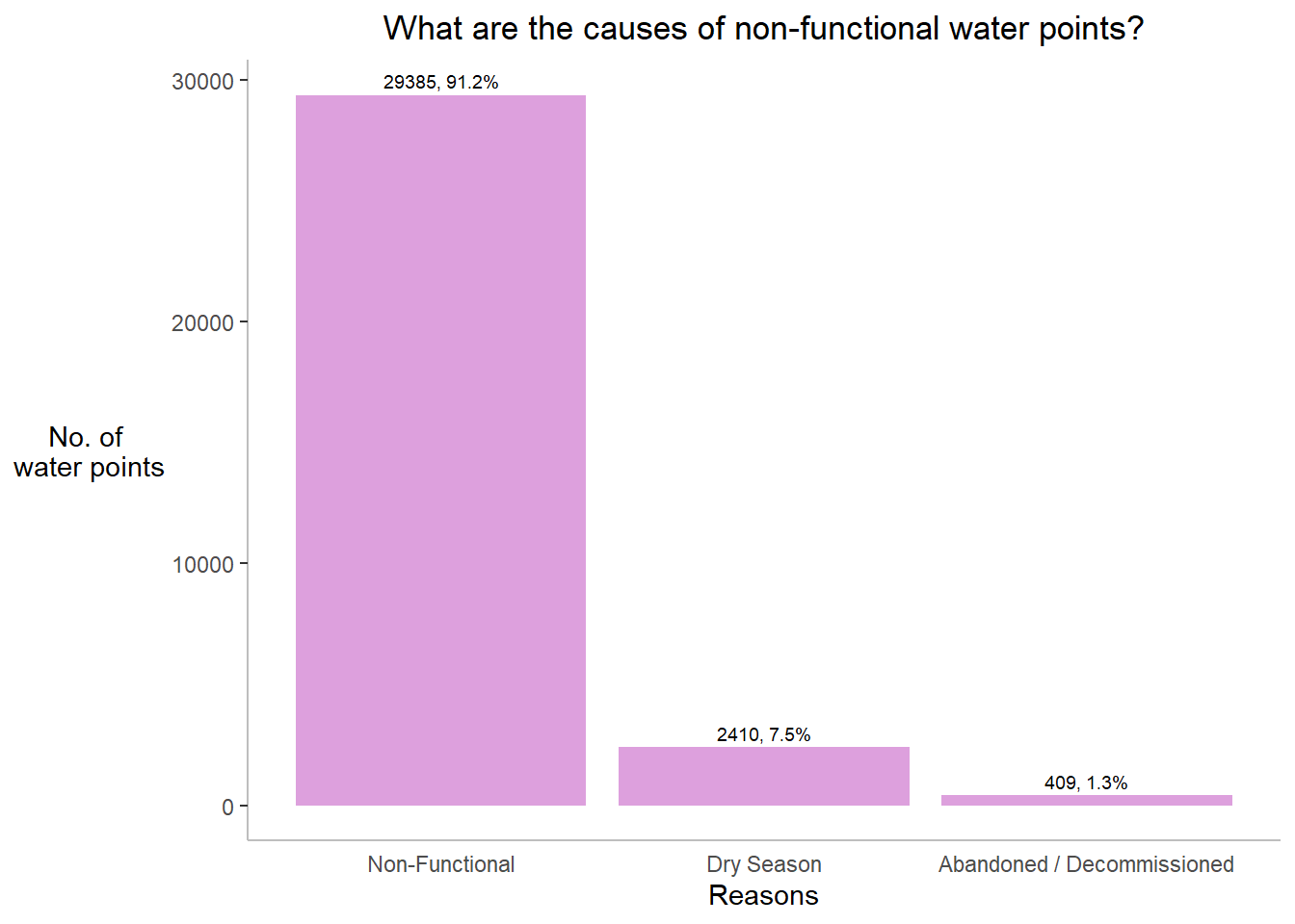
Insights:
Almost 90% of non-functional waterpoints are not reason specific. Some other reasons include dry season , waterpoints are decommissioned or some are left without being taken care of.
Now that, we have understood the non-functional waterpoints better in terms of numbers, let us plot maps to show the spatial distribution of functional and non-functional water point rate at LGA level by using appropriate thematic mapping technique provided by tmap package.
We want to know how the waterpoints are spatially distributed across the country. For that,
Compute the maps indivually for total, functional , non-functional and unknown no. of waterpoints.
Merge into 1 figure using tmap_arrange().
The code chunk below will draw a cartographic standard choropleth map of total, functional, non-functional and unkown waterpoints.
nga_wp <- read_rds("data/nga_wp.rds")
m1 <- tm_shape(nga_wp)+
tm_fill("total wpt",
style = "quantile",
palette = "Blues",
title = "Total \nWaterpoints ratio") +
tm_layout(main.title = "Distribution of total water points ratio by division",
main.title.position = "center",
main.title.size = 1,
legend.height = 1,
legend.width = 1,
legend.text.size = 1,
legend.title.size = 1,
main.title.fontface = "bold",
frame = TRUE) +
tmap_mode("plot")+
tm_borders(alpha = 0.5) +
tm_compass(type="8star",
position=c("right", "top"))m2 <- tm_shape(nga_wp)+
tm_fill("wpt functional",
style = "quantile",
palette = "Blues",
title = "Functional \nWaterpoints ratio") +
tm_layout(main.title = "Distribution of functional water points ratio by division",
main.title.position = "center",
main.title.size = 1,
legend.height = 1,
legend.width = 1,
legend.text.size = 1,
legend.title.size = 1,
main.title.fontface = "bold",
frame = TRUE) +
tmap_mode("plot")+
tm_borders(alpha = 0.5) +
tm_compass(type="8star",
position=c("right", "top"))m3 <- tm_shape(nga_wp)+
tm_fill("wpt non-functional",
style = "quantile",
palette = "Blues",
title = "Non-functional \nWaterpoints ratio") +
tm_layout(main.title = "Distribution of non-functional water points ratio by division",
main.title.position = "center",
main.title.size = 1,
legend.height = 1,
legend.width = 1,
legend.text.size = 1,
legend.title.size = 1,
main.title.fontface = "bold",
frame = TRUE) +
tmap_mode("plot")+
tm_borders(alpha = 0.5) +
tm_compass(type="8star",
position=c("right", "top"))m4 <- tm_shape(nga_wp)+
tm_fill("wpt unknown",
style = "quantile",
palette = "Blues",
title = "Unknown \nWaterpoints ratio") +
tm_layout(main.title = "Distribution of unknown water points ratio by division",
main.title.position = "center",
main.title.size = 1,
legend.height = 1,
legend.width = 1,
legend.text.size = 1,
legend.title.size = 1,
main.title.fontface = "bold",
frame = TRUE) +
tmap_mode("plot")+
tm_borders(alpha = 0.5) +
tm_compass(type="8star",
position=c("right", "top"))The code chunk below uses tmap_arrange() to combine all 4 plots into one.
Insights:
Although we have seen how the overall pattern is, our focus is more on non-functional waterpoints. Also, we were not able to see the exact division in the former plot. So let us be more specific and try viewing in interactive mode.
tm_shape(nga_wp)+
tm_fill("wpt non-functional",
style = "quantile",
palette = "Blues",
title = "Non-functional \nWaterpoints ratio") +
tm_layout(main.title = "Distribution of non-functional water points ratio by division",
main.title.position = "center",
main.title.size = 1,
legend.height = 1,
legend.width = 1,
legend.text.size = 1,
legend.title.size = 1,
frame = TRUE) +
tmap_mode("view")+
tm_borders(alpha = 0.5) +
tm_compass(type="8star",
position=c("right", "top"))Insights:
South eastern divisions such as Bali, Gassol, Ukum, Wukari, Donga constitutes of more no. of non-functional waterpoints whereas central region divisions such as Ganjuwa, Ningi, Toro have medium no. of non-functional waterpoints.
Limitation:
Although exploring using the choropleth maps provide us details, it is limited in their ability to represent geospatial data in a useful and methodologically rigors way.
Hence, let us proceed to using Exploratory Spatial Data Analysis methods where we attempt to establish whether the data is in fact spatially autocorrelated.
Its very important to know not only how many different classes that the data should be categorized into, but aslo what the value ranges of those classes should be. There are most common “default” methods of classifying data. Of all, equal and quantile are common. Each has its own advantages and disadvantages.
Quantiles : This method classifies data into a certain number of categories with an equal number of units in each category.
Equal Intervals : This method sets the value ranges in each category equal in size. The entire range of data values (max - min) is divided equally into however many categories have been chosen.
In the former plots, we have used quantile classiifica, let us now compare with equal interval classification. The below code chunk creates 2 maps classified as equal and quantile interval. Then merged to one using tmap_arrange()
equal <- tm_shape(nga_wp) +
tm_fill("wpt non-functional",
n = 5,
style = "equal",
palette = "Blues") +
tm_borders(alpha = 0.5) +
tm_layout(main.title = "Equal interval classification",
main.title.position = "center",
main.title.size = 2,
legend.height = 1,
legend.width = 1,
legend.text.size = 1,
legend.title.size = 1)+
tmap_mode("plot")+
tm_compass(type="8star",
position=c("right", "top"))quantile <- tm_shape(nga_wp) +
tm_fill("wpt non-functional",
n = 5,
style = "quantile",
palette = "Blues") +
tm_borders(alpha = 0.5) +
tm_layout(main.title = "Quantile interval classification map",
main.title.position = "center",
main.title.size = 2,
legend.height = 1,
legend.width = 1,
legend.text.size = 1,
legend.title.size = 1)+
tmap_mode("plot")+
tm_compass(type="8star",
position=c("right", "top"))Insights:
It is seen that map classification with quantile interval is better than map classification with equal interval as the former clearly spreads out rather clustering into one segment. Hence, quantile style will be used in further analysis.
By measuring global spatial autocorrelation we can find out whether the distribution of non-functional waterpoints are spatially dependent or the distribution is just a random phenomenon.
Before we can compute the global spatial autocorrelation statistics, we need to construct a spatial weights which are used to define the neighbourhood relationships between the divisions in Nigeria.
In general, there are contiguity based spatial weights and distance based spatial weights
Contiguity based spatial weights: Contiguity means that two spatial units share a common border of non-zero length. Operationally, we can further distinguish between a rook and a queen criterion of contiguity.
There are various methods of determining adjacency. The Rook method (named for the chess piece) considers areas adjacent if they are directly located horizontally or vertically on a 2- dimensional plane. The Queen method considers diagonally adjacent locations in addition to the Rook. The spatial weight matrices derived from these methods are Wr and Wq respectively.
Neighbour list object:
Number of regions: 774
Number of nonzero links: 4440
Percentage nonzero weights: 0.7411414
Average number of links: 5.736434
1 region with no links:
86
Link number distribution:
0 1 2 3 4 5 6 7 8 9 10 11 12 14
1 2 14 57 125 182 140 122 72 41 12 4 1 1
2 least connected regions:
138 560 with 1 link
1 most connected region:
508 with 14 linksNeighbour list object:
Number of regions: 774
Number of nonzero links: 4420
Percentage nonzero weights: 0.7378029
Average number of links: 5.710594
1 region with no links:
86
Link number distribution:
0 1 2 3 4 5 6 7 8 9 10 11 12 14
1 2 14 59 127 181 141 124 66 42 11 4 1 1
2 least connected regions:
138 560 with 1 link
1 most connected region:
508 with 14 linksBased on the above two summaries, following analysis is done:
| Metrics | Wr | Wq |
|---|---|---|
| No. of regions without links | 1 | 1 |
| Average no. of links per region | 5.710 | 5.736 |
As all the regions are mentioned by its number, let’s try to find the actual division name.
The below code chunk is to find the actual division name of the numbers mentioned
| Metrics | Results |
|---|---|
| Region with no link | Bakassi |
| Least connected regions | Chanchaga , Offa These two divisions are connected with only 1 division - Bosso |
| Most connected region | Mokwa - is connected with 14 other divisions |
Distance Based Spatial Weights
longitude <- map_dbl(nga_wp$geometry, ~st_centroid(.x)[[1]])
latitude <- map_dbl(nga_wp$geometry, ~st_centroid(.x)[[2]])
coords <- cbind(longitude, latitude)
knn4 <- knn2nb(knearneigh(coords, k=4))
knn6 <- knn2nb(knearneigh(coords, k=6))
knn7 <- knn2nb(knearneigh(coords, k=7))
knn8 <- knn2nb(knearneigh(coords, k=8))| Metric | W(k=4) | W(k=6) | W(k=7) | W(k=8) |
|---|---|---|---|---|
| Avg. no. of links per region | 6 | 6 | 7 | 8 |
Based on the results, k-nearest neighbours method is effective as the average no. of links for W(k=8) is greater than the avg no. of links determined using Queen or Rook’s contiguity based weight matrices.
Justification
However, k-nearest neighbours method is effective when the distribution of the data varies across the region so that some features are far away from all other features. But it’s not the same in this case. The divisions of Nigeria are so connected that all divisions have shared boundaries except one. So, it is very ideal to use contiguity spatial weights specifcally Queen based as the average no. of links per region is higher than Rook’s to compute weight matrices thereby measuring global spatial autocorrelation.
Computing Row-standardised weights matrix
Next, we need to assign weights to each neighboring polygon. The code chunk below uses nb2listw() which supplements a neighbours list with spatial weights for the chosen coding scheme. The coding scheme can be the following:
B - basic binary coding
W - row standardised (sums over all links to n)
C - globally standardised (sums over all links to n)
U - equal to C divided by the number of neighbours (sums over all links to unity)
S - variance-stabilizing coding scheme (sums over all links to n).
The code chunk below uses “W” as weights coding scheme.
[1] FALSECharacteristics of weights list object:
Neighbour list object:
Number of regions: 774
Number of nonzero links: 4440
Percentage nonzero weights: 0.7411414
Average number of links: 5.736434
1 region with no links:
86
Weights style: W
Weights constants summary:
n nn S0 S1 S2
W 773 597529 773 285.0658 3198.414Similarly, all other schemes are tested. All their results say average no. of links = 5.736. And so let us go ahead with “W”.
In this section, we test the hypothesis
H1 (Alternative Hypothesis) - The distribution of non functional waterpoints is spatially dependent through calculating the Moran’s I statistic and Geary’s C ratio for the data set.
H0 (Null Hypothesis) - The distribution of non functional waterpoints is is a random phenomenon.
To establish the p-values of these statistics, we ran the Monte Carlo simulations for Moran’s I and Geary’s C for each weight matrix for each year with 1000 permutations.
As mentioned above, the two measures of spatial autocorrelation that are used in this study
1) Moran’s I statistic - describe how features differ from the values in the study area as a whole
2) Geary’s C Ratio - describes how features differ from their immediate neighbors
Moran’s I Statistic
Generally, Moran’s I is calculated as follows:
where wij is a spatial weight matrix which compares the closeness between location i and location j
xi is the no. of non-functional waterpoints in division i
xj is the no. of non-functional waterpoints in division j
𝜇 is the average no. of non-functional waterpoints
N is the total number of division.
In the code chunk below, moran.test() of spdep package is used to calculate the Moran’s I scores.
[1] TRUE
Moran I test under randomisation
data: nga_wp$`wpt non-functional`
weights: rswm_q n reduced by no-neighbour observations
Moran I statistic standard deviate = 20.043, p-value < 2.2e-16
alternative hypothesis: greater
sample estimates:
Moran I statistic Expectation Variance
0.433932927 -0.001295337 0.000471516 Insights:
It is seen that p value is significant (less than 0.05) and z-score is positive, hence we can reject the null hypothesis and confirm that non-functional water points are not randomly distributed and the spatial distribution of high values and/or low values are more spatially clustered and observations tend to be similar.
The code chunk below performs permutation test for Moran’s I statistic by using moran.mc() of spdep. A total of 1000 simulation will be performed.
The set. seed() function is used here to create reproducible results when writing code that involves creating variables that take on random values. By using this set. seed() function, we can guarantee that the same random values are produced each time we run the code.
Monte-Carlo simulation of Moran I
data: nga_wp$`wpt non-functional`
weights: rswm_q
number of simulations + 1: 1000
statistic = 0.43393, observed rank = 1000, p-value = 0.001
alternative hypothesis: greaterInsights:
This confirms our earlier result even after performing 1000 computations, p value is significant and z score is positive and hence we can reject the null hypothesis and confirm that non-functional water points are not randomly distributed and the spatial distribution of high values and/or low values are more spatially clustered and observations tend to be similar.
Geary’s C Ratio
Another indicator of spatial autocorrelation is the Geary’s contiguity ratio (or Geary’s C). The Geary’s C ratio is based upon a paired comparison of juxtaposed map values and is calculated as follows:
Geary’s C is inversely related to Moran’s I and all the terms calculating C are the same as defined for the Moran’s I. The code chunk below performs Geary’s C test for spatial autocorrelation by using geary.test() of spdep.
Geary C test under randomisation
data: nga_wp$`wpt non-functional`
weights: rswm_q
Geary C statistic standard deviate = 14.457, p-value < 2.2e-16
alternative hypothesis: Expectation greater than statistic
sample estimates:
Geary C statistic Expectation Variance
0.6170907765 1.0000000000 0.0007014859 Insights:
Based on the above result, since the Geary’s C value is less than 1, it is evident that the non-functional waterpoints are clustered and the values tend to be similar.
The code chunk below performs permutation test for Geary’s C statistic by using geary.mc() of spdep. As mentioned above for Moran’s I statistic value computation, here also we used set.seed() function to make sure that the same random values are produced each time we run the code.
Monte-Carlo simulation of Geary C
data: nga_wp$`wpt non-functional`
weights: rswm_q
number of simulations + 1: 1000
statistic = 0.61709, observed rank = 1, p-value = 0.001
alternative hypothesis: greaterInsights:
After performing Monte-Carlo simulation of 1000 permutations, it is statistically confirmed that the distribution of all non-functional water points are spatially dependent, clustered and the observations tend to be similar.
Visualising the results:
It is always a good practice for us to the examine the simulated Moran’s I test statistics and Geary’s C statistical values in greater detail. First let us compute the distributions individually and then merge using patchwork
In the below code, res values are passed as data in the form of dataframe, geom_histogram() function is used to create the histogram and geom_vline() function is used to draw a vertical line at Moran’s I test statistic value.
Similarly, the distribution is observed as density plot using geom_density() function.
The code chunk below plots the distribution of Geary’s C simulated values and its frequency using geom_histogram() functon.
Finally, the distribution of Geary’s C simulated values and its frequencies are viewed as density plot using geom_density() function.
Now, all the distribution plots are merged together as one using
patchwork package - It has a very simple syntax where we can create layouts super easily. The general syntax that combines:
Two-Column Layout using the Plus Sign +
Parenthesis () to create a subplot group
Two-Row Layout using the Division Sign \
plot_annotation() - auto-tagging capabilities, in order to identify subplots in text
theme_economist() of ggthemes package - A theme that approximates the style of The Economist
patchwork <- ((p1 / p3) | (p2 / p4)) + plot_annotation(tag_levels = 'I')
patchwork & theme_economist()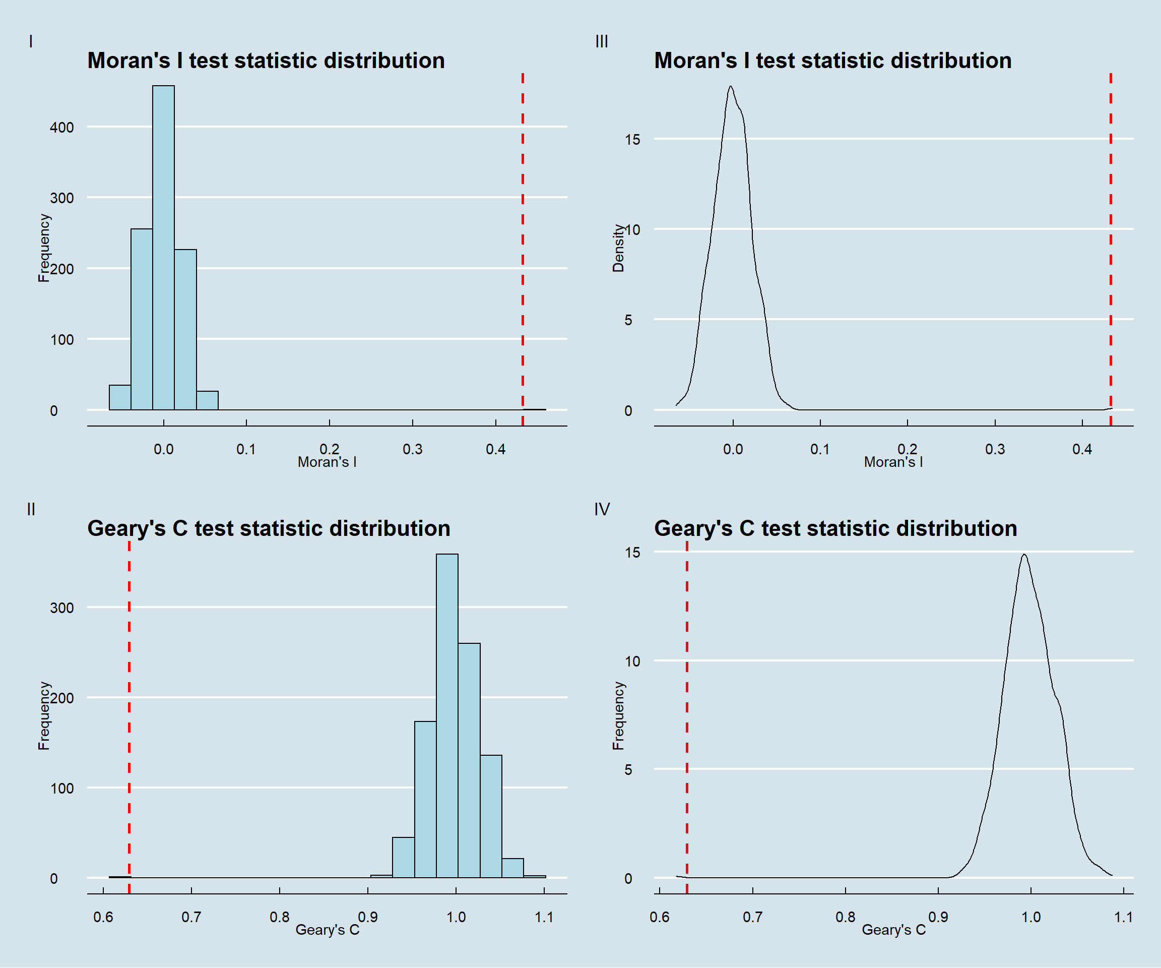
Interpretation:
From the subplots I and III, we can understand that actual Moran’s I statistic (indicated as red dashed line) is quite far away from the simulated values towards the right. Hence we can confirm that there is positive autocorrelation among the features.
Similarly, from the subplots II and IV, we can understand that that actual Geary’s C statistic (indicated as red dashed line) is quite far away from the simulated values towards the left unlike Moran’s I test statistic value. Both these test values are inversely related. Hence we can confirm that there is positive autocorrelation among the features.
Analysis:
As we have understood that features are positively auto correlated, we can confirm the following:
Clustering - The spatial distribution of non-functional waterpoints tend to be in similar locations.
Neighbours are similar - Their neighbours are more alike than they would be under spatial randomness.
Comparison of Moran’s I and Geary’s C spatial correlogram
Let us examine the patterns of spatial autocorrelation in the data using spatial correlograms. It helps us to understand how correlated are pairs of spatial observations when the distance (lag) between them is increased. Precisely, theses are plots of some index of autocorrelation (Moran’s I or Geary’s c) against distance.
In the code chunk below, sp.correlogram() of spdep package is used to compute a 10-lag spatial correlogram of non-functional waterpoints. The global spatial autocorrelation used in Moran’s I and Geary’s C in subsequent code lines.
The plot() of base graph is then used to plot the output and the plots are arranged using par(mfrow()) parameter, here it is 1 row and 2 columns.
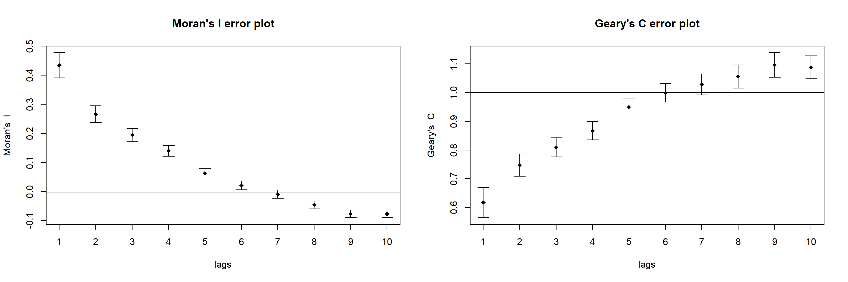
Interpretation: The plots reveal that the relationship between Moran’s I and Geary’C test statistic values are inverse. Moran’s I values approach -1 whereas Geary’s C test values approach 2 for subsequent lags which indicates that quite dissimilar values tend to form a cluster.
By plotting the output might not allow us to provide complete interpretation. This is because not all autocorrelation values are statistically significant. Hence, it is important for us to examine the full analysis report by printing out the analysis results as in the code chunk below.
Spatial correlogram for nga_wp$`wpt non-functional`
method: Moran's I
estimate expectation variance standard deviate Pr(I) two sided
1 (773) 4.3393e-01 -1.2953e-03 4.7152e-04 20.0433 < 2.2e-16
2 (773) 2.6647e-01 -1.2953e-03 2.0206e-04 18.8374 < 2.2e-16
3 (773) 1.9507e-01 -1.2953e-03 1.2189e-04 17.7863 < 2.2e-16
4 (773) 1.4019e-01 -1.2953e-03 8.7589e-05 15.1181 < 2.2e-16
5 (773) 6.3735e-02 -1.2953e-03 6.8779e-05 7.8413 4.459e-15
6 (773) 2.1698e-02 -1.2953e-03 5.7380e-05 3.0354 0.002402
7 (773) -8.8208e-03 -1.2953e-03 5.0377e-05 -1.0603 0.289021
8 (773) -4.5305e-02 -1.2953e-03 4.6074e-05 -6.4837 8.952e-11
9 (773) -7.6086e-02 -1.2953e-03 4.3585e-05 -11.3287 < 2.2e-16
10 (773) -7.6594e-02 -1.2953e-03 4.2342e-05 -11.5718 < 2.2e-16
1 (773) ***
2 (773) ***
3 (773) ***
4 (773) ***
5 (773) ***
6 (773) **
7 (773)
8 (773) ***
9 (773) ***
10 (773) ***
---
Signif. codes: 0 '***' 0.001 '**' 0.01 '*' 0.05 '.' 0.1 ' ' 1Spatial correlogram for nga_wp$`wpt non-functional`
method: Geary's C
estimate expectation variance standard deviate Pr(I) two sided
1 (773) 0.61709078 1.00000000 0.00070149 -14.4573 < 2.2e-16 ***
2 (773) 0.74726091 1.00000000 0.00038571 -12.8689 < 2.2e-16 ***
3 (773) 0.80953972 1.00000000 0.00027325 -11.5219 < 2.2e-16 ***
4 (773) 0.86705201 1.00000000 0.00024463 -8.5002 < 2.2e-16 ***
5 (773) 0.94961811 1.00000000 0.00024087 -3.2462 0.001169 **
6 (773) 0.99919645 1.00000000 0.00026273 -0.0496 0.960462
7 (773) 1.02833918 1.00000000 0.00032695 1.5673 0.117048
8 (773) 1.05591178 1.00000000 0.00040558 2.7763 0.005499 **
9 (773) 1.09586502 1.00000000 0.00045556 4.4915 7.074e-06 ***
10 (773) 1.08793934 1.00000000 0.00039883 4.4034 1.066e-05 ***
---
Signif. codes: 0 '***' 0.001 '**' 0.01 '*' 0.05 '.' 0.1 ' ' 1Interpretation:
Both Moran’s I and Geary’s C test results show that at 90% confidence, (alpha value = 0.01), most of the autocorrelated values are significant. And hence we can reject the null hypothesis stating the feature are random and with statistical evidences, we can confirm the following
Observed spatial pattern of non-functional waterpoint values is spatially dependent and not equally likely as any other spatial pattern.
Non-functional waterpoint values at one location depends on values at other (neighbouring) locations.
Any non-functional waterpoint values altered at one location will affect the other location values.
While the global Moran’s I score and the Geary’s C ratio can tell us whether non-functional waterpoints tend to cluster or not on the map, it does not provide any information on the distribution of spatial dependence of non-functional waterpoints and it is unable to identify the location of hotspots and clusters. Let us apply appropriate Local Indicators for Spatial Association (LISA), especially local Moran’I to detect cluster and/or outlier from non-functional waterpoints of Nigeria.
Computing & Mapping Local Moran’s test statistic I and p-value
To compute local Moran’s I, the localmoran() function of spdep will be used. It computes Ii values, given a set of zi values and a listw object providing neighbour weighting information for the polygon associated with the zi values.
The code chunks below are used to compute local Moran’s I at shape level (here, divisions)
Ii E.Ii Var.Ii Z.Ii Pr(z != E(Ii))
1 -0.32365786 -9.995243e-04 1.924638e-01 -0.73547576 0.46204980
2 0.07000542 -4.092463e-05 1.053077e-02 0.68258288 0.49487045
3 1.25819985 -1.627684e-03 4.181728e-01 1.94819847 0.05139122
4 -0.03537489 -5.427505e-05 5.954304e-03 -0.45773361 0.64714384
5 0.01201533 -2.590965e-04 3.988998e-02 0.06145673 0.95099547
6 0.00768085 -1.538445e-07 1.687859e-05 1.86960486 0.06153871localmoran() function returned a matrix of values whose columns are:
Ii: the local Moran’s I statistics
E.Ii: the expectation of local moran statistic under the randomisation hypothesis
Var.Ii: the variance of local moran statistic under the randomisation hypothesis
Z.Ii:the standard deviate of local moran statistic
Pr(): the p-value of local moran statistic
Let us rename the p values column from Pr(z != E(Ii)) to Pr.Ii for ease of use.
Let us now map both local Moran’s I and p values Using choropleth mapping functions of tmap package for effective interpretation.
localMI.map <- tm_shape(nga_wp.localMI) +
tm_fill(col = "Ii",
style = "pretty",
palette = "RdBu",
title = "Local Moran's I values") +
tm_borders(alpha = 0.5) +
tm_layout(main.title = "Local Moran statistics ",
main.title.size = 1.5,
main.title.position = "center",
main.title.fontface = "bold")+
tm_compass(type="8star",
position=c("right", "top"))
pvalue.map <- tm_shape(nga_wp.localMI) +
tm_fill(col = "Pr.Ii",
breaks=c(-Inf, 0.001, 0.01, 0.05, 0.1, Inf),
palette="-Blues",
title = "Local Moran's I p-values") +
tm_borders(alpha = 0.5)+
tm_layout(main.title = "Local Moran's p values",
main.title.size = 1.5,
main.title.position = "center",
main.title.fontface = "bold")+
tm_compass(type="8star",
position=c("right", "top"))
tmap_arrange(localMI.map, pvalue.map, asp=1, ncol=2)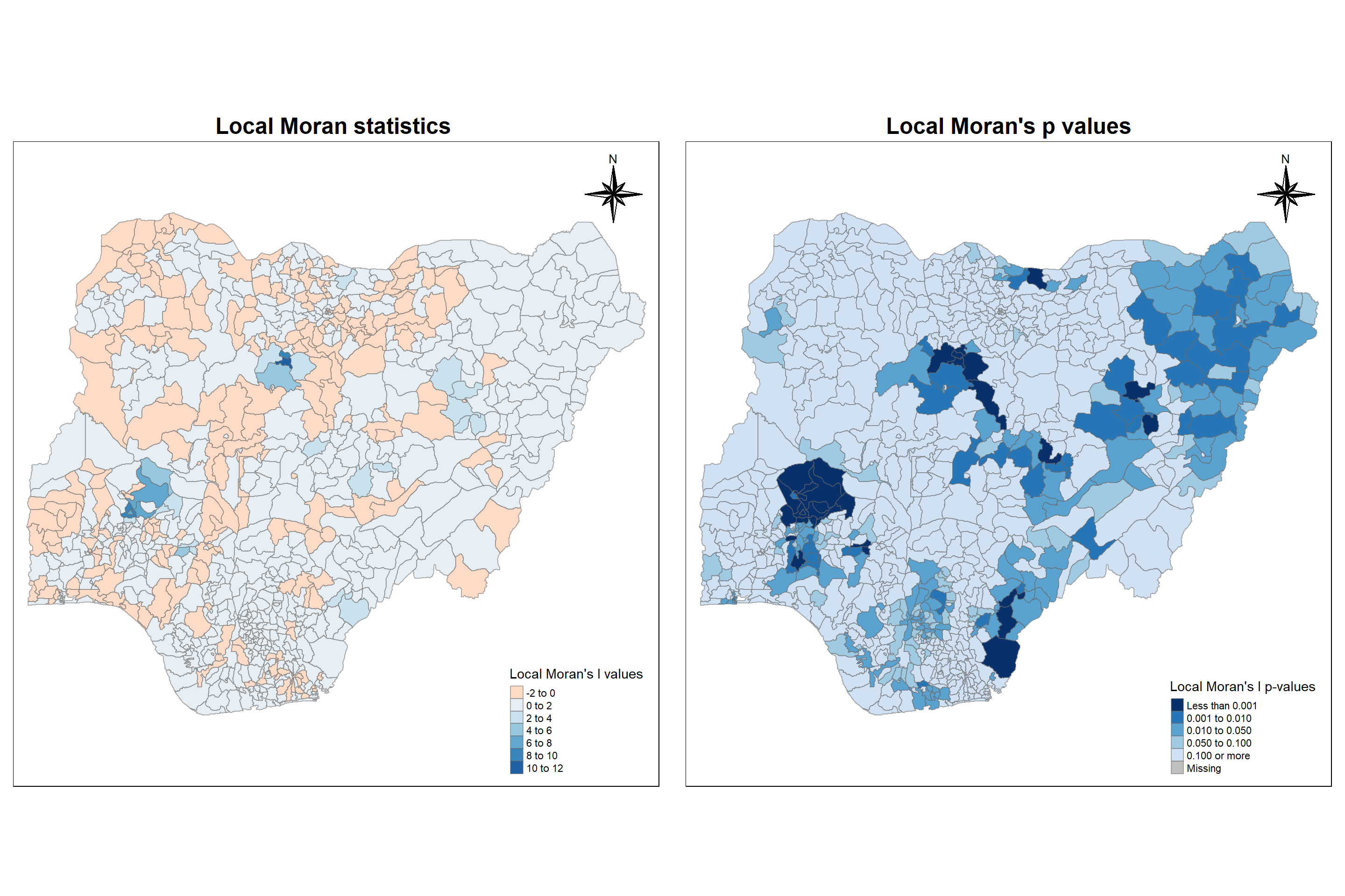
Interpretation:
From the left map, we can understand the following
Cluster - All positive valued region have neighboring features with similarly high or low attribute values
Outlier - All negative valued regions have neighboring features with dissimilar values
From the right map, we can understand the following
For every corresponding I value, we can locate the regions which are significant or not.
Darker the region, higher the significance.
It is seen that there are 189 significant regions. For better understanding, let us plot to study only the divisions which are significant.
localMI.signfmap <-
tm_shape(nga_wp.localMI) +
tm_fill("white") +
tm_borders(alpha = 0.5) +
tm_shape(nga_wp.localMI %>%
filter(Pr.Ii <= 0.05)) +
tm_fill(col = "Ii",
style = "pretty",
palette = "RdBu",
title = "Local Moran's I values") +
tm_borders(alpha = 0.5) +
tm_layout(main.title = "Local Moran's I-significant values ",
main.title.size = 1,
main.title.position = "center",
main.title.fontface = "bold")+
tmap_mode("view")
localMI.signfmapInsights:
From our analysis, we see that 189 regions are significant.
Divisions like Zaria, Sabon-Gari in the central region, Oyun in the west have most similar features as they are highly positive.
Divisions like Alkaleri, Ibi, Awe in the eastern region, Zango-Kataf, Chikun, Kajuru in the central region, Ijebu East, Orhionmwon in the southwest region having negative Moran’s I values indicate that they have dissimilar features.
Let us now use LISA Cluster Map to visualise the significant locations color coded by type of spatial autocorrelation. Let us first plot Moran scatterplot to generate the LISA cluster map.
Moran Scatterplots
The Moran Scatterplot allows us to study the local spatial instability of the distribution of functional and non-functional waterpoints in Nigeria. The spdep package provides the moran.plot() function to help us to plot the Moran Scatterplot. The various regions are distributed across the scatterplot, with spatially lagged values of non-functional waterpoints in these regions plotted on the y-axis against the original values of non-functional waterpoints on the x-axis.
Before plotting, let’s scale the variable for standardization for both functional and non-functional.
The Moran scatterplot is divided into four areas, with each quadrant corresponding with one of four categories:
High-High (HH) in the top-right quadrant;
High-Low (HL) in the bottom right quadrant;
Low-High (LH) in the top-left quadrant;
Low-Low (LL) in the bottom left quadrant.
par(mfrow=c(2,1))
ncif <- moran.plot(nga_wp$z.f, rswm_q,
labels=as.character(nga_wp$shapeName),
xlab="Z-functional waterpoints",
ylab="Spatially Lag Z-functional waterpoints")
nci_nf <- moran.plot(nga_wp$z.nf, rswm_q,
labels=as.character(nga_wp$shapeName),
xlab="Z-Non-functional waterpoints",
ylab="Spatially Lag Z-Non-functional waterpoints")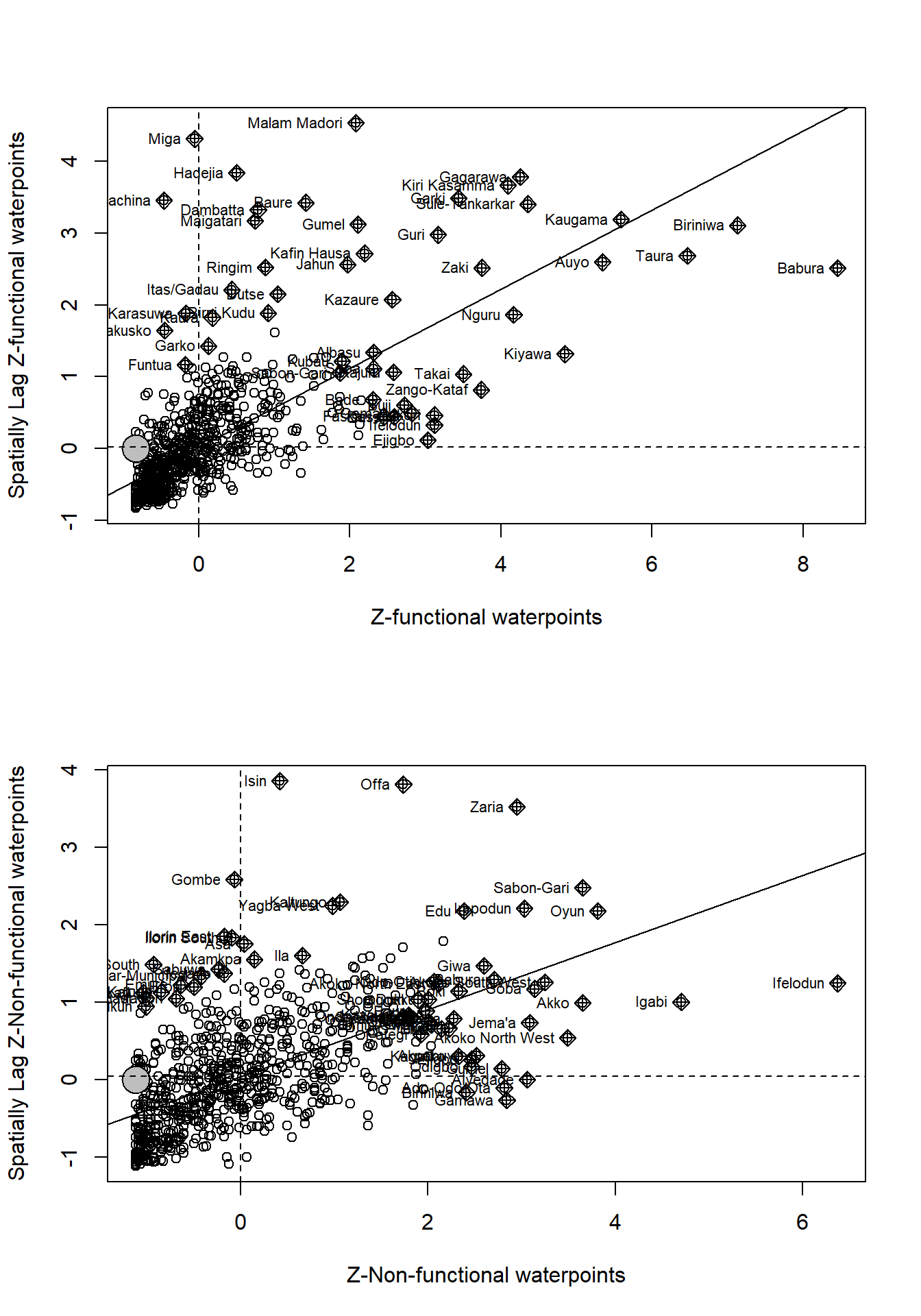
Interpretation:
From subplot 1, we understand functional water points are located in the Low-Low quadrant which indicates that they are associated with relatively low values in surrounding locations.Similarly, from subplot 2, we understand that non-functional waterpoints are all over place in all the four quadrants although there is an edge in the Low-Low quadrant like the functional waterpoints.
The direction and magnitude of global autocorrelation is observed in a Moran Scatterplot, as the slope of the linear regression of the lagged values of waterpoints vs the original frequencies of waterpoints is equivalent to the Moran’s I score. However, we are not able to see which of these areas are significant. For that, we perform LISA analysis.
The code chunk below prepares a LISA cluster map.
localMIf <- localmoran(nga_wp$`wpt functional`,rswm_q)
nga_wp.localMIf <- cbind(nga_wp,localMIf) %>%
rename(Pr.Ii = Pr.z....E.Ii..)
quadrantf <- vector(mode="numeric",length=nrow(localMIf))
nga_wp$lag_functional <- lag.listw(rswm_q, nga_wp$`wpt functional`)
DVf <- nga_wp$lag_functional - mean(nga_wp$lag_functional)
LM_If <- localMIf[,1]
signiffunc <- 0.05
quadrantf[DVf <0 & LM_If>0] <- 1
quadrantf[DVf >0 & LM_If<0] <- 2
quadrantf[DVf <0 & LM_If<0] <- 3
quadrantf[DVf >0 & LM_If>0] <- 4
quadrantf[localMIf[,5]>signiffunc] <- 0quadrant <- vector(mode="numeric",length=nrow(localMI))
nga_wp$lag_nonfunctional <- lag.listw(rswm_q, nga_wp$`wpt non-functional`)
DV <- nga_wp$lag_nonfunctional - mean(nga_wp$lag_nonfunctional)
LM_I <- localMI[,1]
signif <- 0.05
quadrant[DV <0 & LM_I>0] <- 1
quadrant[DV >0 & LM_I<0] <- 2
quadrant[DV <0 & LM_I<0] <- 3
quadrant[DV >0 & LM_I>0] <- 4
quadrant[localMI[,5]>signif] <- 0Now let us build and plot the LISA map by using the code chunks below for both functional and non-functional water points.
nga_wp.localMIf$quadrant <- quadrantf
colors <- c("#ffffff", "#2c7bb6", "#abd9e9", "#fdae61", "#d7191c")
clusters <- c("insignificant", "low-low", "low-high", "high-low", "high-high")
LISAmapf <- tm_shape(nga_wp.localMIf) +
tm_fill(col = "quadrant",
style = "cat",
palette = colors[c(sort(unique(quadrantf)))+1],
labels = clusters[c(sort(unique(quadrantf)))+1])+
#popup.vars = c("")) +
tmap_mode("plot")+
tm_view(set.zoom.limits = c(11,17)) +
tm_borders(alpha=0.5)+
tm_compass(type="8star",
position=c("right", "top"))+
tm_layout(main.title = "LISA Map (Functional)",
main.title.fontface = "bold",
main.title.position = "center",
legend.height = 1,
legend.width = 1,
legend.text.size = 1,
legend.title.size = 1,)nga_wp.localMI$quadrant <- quadrant
colors <- c("#ffffff", "#2c7bb6", "#abd9e9", "#fdae61", "#d7191c")
clusters <- c("insignificant", "low-low", "low-high", "high-low", "high-high")
LISAmap <- tm_shape(nga_wp.localMI) +
tm_fill(col = "quadrant",
style = "cat",
palette = colors[c(sort(unique(quadrant)))+1],
labels = clusters[c(sort(unique(quadrant)))+1])+
#popup.vars = c("")) +
tmap_mode("plot")+
tm_view(set.zoom.limits = c(11,17)) +
tm_borders(alpha=0.5)+
tm_compass(type="8star",
position=c("right", "top"))+
tm_layout(main.title = "LISA Map (Non-functional)",
main.title.fontface = "bold",
main.title.position = "center",
legend.height = 1,
legend.width = 1,
legend.text.size = 1,
legend.title.size = 1)Let us plot both LISA maps of functional and non-functional waterpoints next to each other for better interpretation.
Interpretation:
We can see that spatial distribution of functional waterpoints are positively autocorrelated in the northern region i.e. those are associated with relatively high values of the surrounding locations.
On the other hand, spatial distribution of non-functional waterpoints are positively autocorrelated in parts of south east, west and central part of the nation.
In the previous sections, we have detected cluster and outliers for the spatial distribution of non-functional water points. In this section let us detect hot spot and/or cold spot areas using localised spatial statistics.
Getis and Ord’s G-Statistics
It is an alternative spatial statistics to detect spatial anomalies. Here, statistically significant hot-spots are recognised as areas of high values where other areas within a neighbourhood range also share high values too.
The analysis consists of three steps:
Deriving spatial weight matrix
Computing Gi statistics
Mapping Gi statistics
Deriving spatial weight matrix
In section 5.6, after trying multiple spatial weights, we have concluded that (adaptive weight) K-nearest neighbour is effective and so we are computing spatial weight matrix using nb2listw() which is used to convert the nb object into spatial weights object.
Neighbour list object:
Number of regions: 774
Number of nonzero links: 6192
Percentage nonzero weights: 1.033592
Average number of links: 8
Non-symmetric neighbours listComputing Gi statistics
The code chunk below is used to compute the Gi values for both functional and non-functional waterpoints by using an adaptive distance weight matrix.
fips <- order(nga_wp$shapeName)
gi.nfadaptive <- localG(nga_wp$`wpt non-functional`, knn_lw)
nga_nfwp.gi <- cbind(nga_wp, as.matrix(gi.nfadaptive)) %>%
rename(gstatnf_adaptive = as.matrix.gi.nfadaptive.)
gi.fadaptive <- localG(nga_wp$`wpt functional`, knn_lw)
nga_fwp.gi <- cbind(nga_wp, as.matrix(gi.fadaptive)) %>%
rename(gstatf_adaptive = as.matrix.gi.fadaptive.)Mapping Gi statistics
Let us visualise the locations of hot spot and cold spot areas of functional and non-functional waterpoints acroos the country. The choropleth mapping functions of tmap package will be used to map the Gi values.
The code chunk below shows the functions used to map the Gi values derived using adaptive distance weight matrix.
Gimap_f <- tm_shape(nga_fwp.gi) +
tm_fill(col = "gstatf_adaptive",
style = "pretty",
palette="-RdBu",
title = "local Gi") +
tm_borders(alpha = 0.5)+
tm_layout(main.title = "Gi Map (Functional)",
main.title.fontface = "bold",
main.title.position = "center",
legend.height = 1,
legend.width = 1,
legend.text.size = 1,
legend.title.size = 1,)+
tm_compass(type="8star",
position=c("right", "top"))Gimap_nf <- tm_shape(nga_nfwp.gi) +
tm_fill(col = "gstatnf_adaptive",
style = "pretty",
palette="-RdBu",
title = "local Gi") +
tm_borders(alpha = 0.5)+
tm_layout(main.title = "Gi Map (Non-Functional)",
main.title.fontface = "bold",
main.title.position = "center",
legend.height = 1,
legend.width = 1,
legend.text.size = 1,
legend.title.size = 1,)+
tm_compass(type="8star",
position=c("right", "top"))Let us plot both the maps next to each other for better understanding using tmap_arrange() function.
Interpretation:
Plotting Gi map for functional and non-functional waterpoints help us to understand that functional points are associated with relatively high values of the surrounding locations (clustered- hotspot areas) and non-functional water points are associated with relatively low values in surrounding locations (scattered - coldspot) in northern region of Nigeria. Similarly, functional points are more scattered and non-functional points are more clustered in south eastern region of Nigeria.
Throughout the study, we have come across lot of observations and interpretations from graphs, charts and maps. To conclude, based on the objective of this study, focusing on spatial pattern of non-functional waterpoints, both LISA map and GI Map reveals that parts of southeastern regions, parts of west and central region which are darker in both the maps indicate that they are associated with relatively high values of the surrounding locations i.e. clustered and majority of the eastern region doesn’t have any waterpoints (unknown). These are the observations which are matter of concern and has to be taken care of.
The study of the spatial distribution of waterpoints in Nigeria using the approach of Global and Local measures of Autocorrelation had generated much insights regarding the waterpoints distribution. The LISA analysis in particular helped to locate statistically significant hotspots of waterpoints more rigorously than choropleths maps.Such geospatial analytics methods are quite important supplement to traditional analysis as the latter only provides the locational context not the analytical context.
Tiefelsdorf, M., Griffith, D. A., Boots, B. 1999 A variance-stabilizing coding scheme for spatial link matrices, Environment and Planning A, 31, pp. 165-180